
How to Choose Grout Colour for Tiles Well
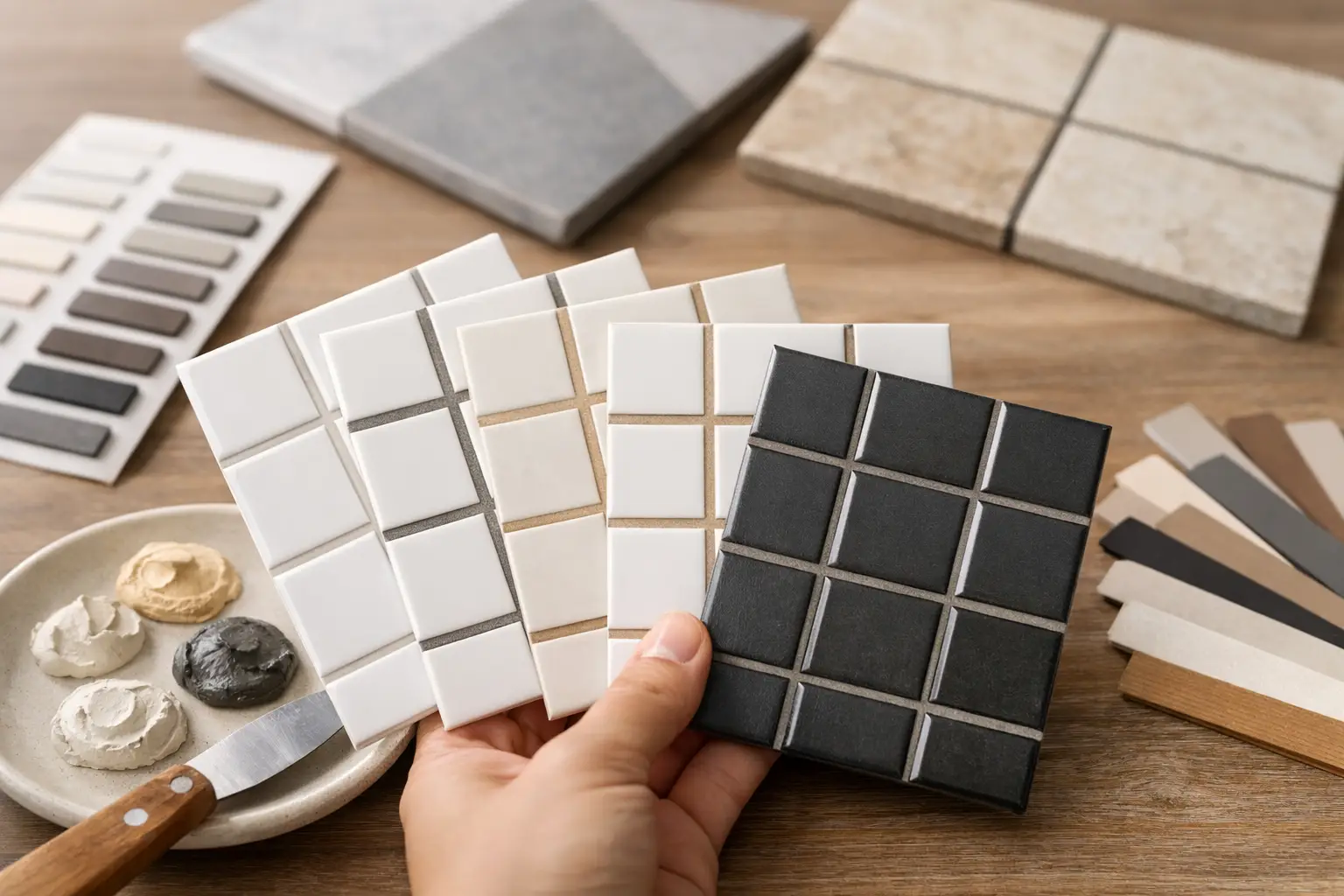
A tile selection can look exceptional in the showroom and still lose impact once the grout is applied. The reason is simple: grout occupies every joint across the surface, so its colour changes how the tile pattern reads from the other side of the room. Knowing how to choose grout colour for tiles is therefore not a finishing afterthought. It is a design decision that affects scale, cleanliness, contrast and the overall quality of the installation.
For a refined result, choose grout alongside the tile, not after it. View real samples in the room where they will be installed, consider the joint width and decide whether you want the tile itself or the grid of the layout to take visual priority.
Start with the look you want the tiles to create
There are three reliable directions: blend the grout with the tile, create a controlled contrast, or choose a tone that sits between the tile and the wider colour palette.
A closely matched grout produces a quieter, more continuous surface. This is often the right choice for large-format porcelain, natural stone-look tiles and bathrooms where a calm, spa-like finish is the goal. With fewer visible lines, the eye is drawn to the texture, veining and scale of the tile rather than the joints. Matching does not mean selecting the exact same shade. A grout that is slightly lighter or darker can look more natural and is often more forgiving once installed.
Contrasting grout makes the layout part of the design. It can give classic white metro tiles crisp definition, highlight a herringbone splashback or bring rhythm to a small-format floor. The trade-off is that contrast exposes every line. Tile spacing, cuts around fittings and alignment must be executed with real precision, because the grout will make inconsistencies more noticeable.
A mid-tone grout is frequently the most practical choice for busy homes and commercial spaces. It retains definition without creating a harsh grid, while disguising everyday marks better than bright white or very pale grey. For many kitchens, laundries, entrances and alfresco areas, this is where visual polish and long-term maintenance meet.
How to choose grout colour for tiles in the room
A grout sample held against one loose tile is useful, but it is not enough. Grout colour is influenced by the amount of tile around it, the room’s daylight, artificial lighting and nearby finishes such as cabinetry, benchtops and paint.
Check the light at different times of day
Natural light can make cool greys appear blue and warm whites look creamier than expected. Evening lighting can have just as much influence, particularly in bathrooms, kitchens and hospitality fit-outs where the space is regularly used after dark. Place tile and grout samples on site and view them in morning light, afternoon light and under the installed or proposed light fittings.
This matters most with whites, greys and greige tones. A grout labelled ‘light grey’ may be ideal with one porcelain tile but read unexpectedly cool beside warm travertine-look tiles or timber cabinetry. Samples protect the final result from costly guesswork.
Consider the size of the space and tile format
Large tiles with narrow, colour-matched joints can make a compact bathroom feel more open and composed. Dark grout around pale tiles creates a more graphic finish and can make the tiled area feel busier, which may be exactly right for a feature wall but less suitable for every surface in a small room.
With mosaic tiles, grout is a major part of what you see. A sheet of small hexagons or penny rounds contains far more joint than a large-format floor, so even a subtle grout shift has a strong effect. Take extra care with sample boards for mosaics, encaustic-look tiles and detailed patterns.
Let the layout influence the decision
Stack bond, brick bond, herringbone and chevron layouts each tell a different visual story. A matching grout softens these patterns; contrast celebrates them. If a herringbone pattern is intended as the focal point, a considered contrast can be striking. If the tile has prominent natural variation, a close grout match will prevent the wall or floor from becoming visually crowded.
The same principle applies to rectified tiles with fine joints. Their clean edges support a minimal, continuous appearance when paired with a sympathetic grout. Wider joints offer a more traditional feel and give the grout colour greater presence.
Choose for the tile material, not only the shade
Tiles with movement, texture or variation need a grout colour that works across the full range of the batch. A single pale tile might suit a bright grout, while the darker tiles in the same carton could look mismatched beside it. Lay out several tiles before deciding, especially with marble-look porcelain, handmade ceramics and natural stone.
For natural stone, grout selection should also respect the stone’s porosity and finish. Some materials require careful sealing and compatible products to prevent staining or colour change. A premium installation is built on this preparation as much as the visible finish. The grout should support the material, not introduce avoidable risk.
With handmade or imperfect-edge tiles, joints are part of the character. A grout close to the body colour often feels authentic and lets the texture lead. A high-contrast option can work, but it creates a more deliberately graphic look and should be chosen with confidence rather than by default.
Balance appearance with day-to-day maintenance
White grout can look beautifully fresh, particularly on a bathroom wall or kitchen splashback. On a high-traffic floor, however, it may demand more frequent cleaning and can show wear sooner. Very dark grout has its own compromise: soap residue, mineral deposits and dust can be more obvious, particularly in showers and hard-water areas.
Mid-grey, warm grey, mushroom and soft taupe shades are often excellent practical performers. They accommodate light daily soiling without looking dull, and they work across many contemporary tile palettes. In commercial bathrooms, entry zones and family kitchens, this extra resilience can preserve a considered finish between professional cleans.
Cleaning habits should inform the decision, but should not lower the design standard. The right grout colour is one that still looks intentional after the space has been lived in. Use suitable pH-neutral cleaners where specified and avoid harsh products that can damage grout, sealers or delicate tile finishes.
Do not confuse grout with perimeter sealant
Grout belongs between tiles. Changes of plane, such as where a wall meets a floor, where tiled walls meet each other, and around baths or shower trays, generally require a flexible sanitary sealant rather than rigid grout. These areas move independently and need a finish that can accommodate that movement while maintaining a clean line.
The sealant colour should be planned with the grout colour, but it will not always be a perfect visual match. This is normal. What matters is that the transition is neat, compatible with the wet-area system and finished with care. In bathrooms, correct waterproofing and precise finishing details protect the appearance of the room as well as its structure.
Make the final choice from a mock-up, not a chart
Colour charts are a starting point, not a final approval. Grout can dry differently depending on the product, tile porosity, water ratio, application and lighting. The most dependable approach is a small on-site mock-up using the selected tile, proposed joint width and chosen grout.
A mock-up lets you assess whether the colour is too cool, too dark or too visually busy before the full installation begins. It also confirms whether the grout is enhancing the tile’s edges, veining and format as intended. For a high-end home, retail space or multi-unit development, this small step provides valuable certainty and supports consistency across the project.
At Perfectly Laid, the aim is never simply to fill joints. It is to deliver a tiled surface where preparation, alignment, grout and finishing details work together with purpose.
Trust the finish your eye returns to
When comparing options, step back several metres and ask what you notice first. If you want the room to feel quiet and expansive, choose the grout that lets the tile read as one composed surface. If the pattern is the feature, choose the grout that defines it cleanly. The best choice is the one that continues to look considered after the samples are put away, the room is furnished and the space becomes part of everyday life.