Best Tile Patterns for Kitchens That Last
A kitchen pattern should do more than look impressive in a showroom. It needs to sit comfortably with cabinetry, light and daily wear, while allowing the tile installation itself to remain crisp at every edge and junction. The best tile patterns for kitchens are the ones that suit the proportions of the room, the character of the home and the level of maintenance you are prepared to take on.
At Perfectly Laid, we see pattern selection as part of the wider finish, not a decorative decision made in isolation. Tile size, substrate preparation, set-out lines, grout choice and cutting accuracy all affect whether a pattern feels considered or compromised. A beautiful tile can lose its impact quickly if the layout is poorly planned.
Start with the kitchen’s scale and sightlines
Before choosing a pattern, look at where the eye naturally lands. In an open-plan kitchen, the island, splashback and transition into adjoining living areas often become the visual anchors. In a compact galley kitchen, the longest wall or floor run usually dictates the most flattering direction for the tile.
A pattern with many joints, such as small mosaics or basketweave, can give a generous room texture and character. In a smaller kitchen, it may create visual noise unless the palette is restrained. Conversely, larger tiles and quieter layouts can make a narrow space feel calmer, but they demand careful preparation. Large-format tiles reveal uneven walls and floors far more readily than smaller formats.
The practical question is not simply, “Which pattern is fashionable?” It is, “Where should the pattern do its work?” A statement splashback can carry movement and personality while the floor remains refined and durable. If the floor is the feature, a simpler splashback often gives the whole room room to breathe.
The best tile patterns for kitchens
Straight lay: clean, architectural and adaptable
A straight lay places tiles in aligned horizontal and vertical rows. It is one of the most versatile kitchen patterns because it can read as contemporary, classic or quietly industrial depending on the tile chosen. Square tiles laid in a grid bring order to a traditional space, while long porcelain planks can create a sleek, linear finish.
This is not necessarily the easiest option from an installation perspective. Straight lines expose inaccuracies. If the room is out of square, or cabinetry is not perfectly aligned, the set-out must be planned so narrow cuts do not become the first thing you notice. Centring the layout from a key focal point, rather than blindly following an uneven wall, is often the difference between an ordinary result and a precise one.
Straight lay suits kitchen floors particularly well when you want the cabinetry, stonework or joinery to take centre stage.
Brick bond: relaxed character with proven appeal
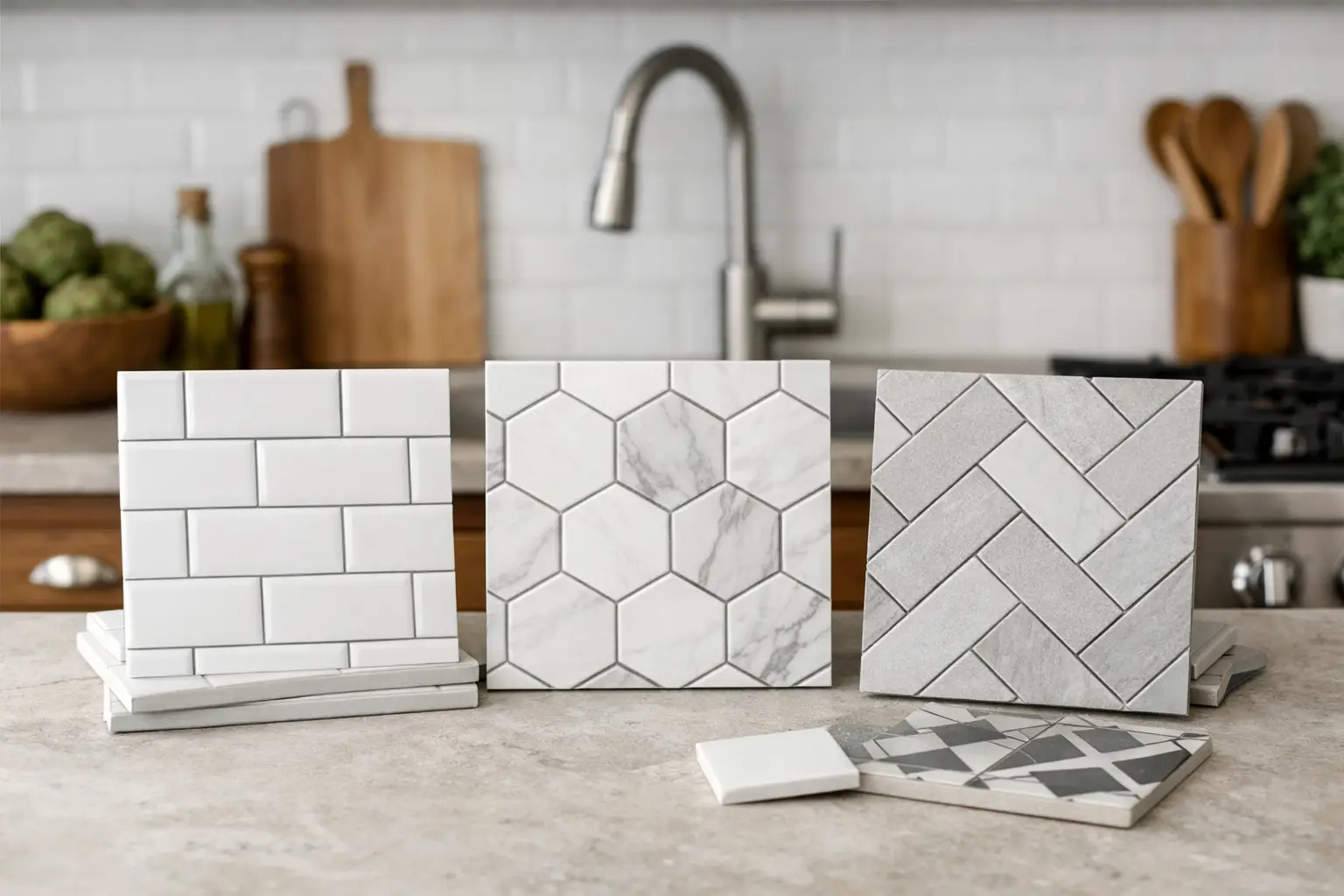
Brick bond, also called running bond, offsets each row by half a tile. It is a natural choice for subway tiles on splashbacks and works beautifully in period homes, coastal interiors and kitchens that need a little warmth without excessive ornament.
The pattern is forgiving in rooms where walls are not perfectly square, and its horizontal emphasis can make a compact kitchen feel wider. A vertical brick bond has the opposite effect, drawing the eye upward and giving a low-ceilinged room more presence.
There is a technical consideration with long rectangular tiles. A 50 per cent offset can exaggerate natural bowing in some tiles, leaving lippage where raised edges catch the light or feel uneven underfoot. For floor applications, a third-offset layout may be the better technical choice. Your tiler should assess the tile itself, not simply follow a pattern image.
Herringbone: movement with a tailored finish
Herringbone is one of the most requested patterns for kitchen splashbacks, and for good reason. The repeated V-shape adds movement while still feeling polished and deliberate. It can elevate a simple white ceramic tile or bring structure to a richly coloured handmade-look tile.
This pattern is strongest when it has enough room to be seen. On a broad splashback behind a cooktop or across a long run of cabinetry, herringbone feels refined and expressive. In a very small area crowded by power points, shelves and appliances, it can become busy.
Herringbone also requires more cuts than a straight or brick layout, particularly at perimeter edges. Those cuts must be consistent, balanced and neatly finished. Allow for additional labour and tile wastage, especially where a feature border, niche or return wall is involved. The result can be exquisite, but it relies on disciplined set-out from the first tile.
Stack bond: modern geometry for a confident kitchen
Stack bond aligns rectangular tiles directly above one another, creating a strong grid. It is a clean choice for contemporary kitchens, especially with slim vertical tiles, tonal grout and flat-panel joinery. Vertical stack bond can make a splashback feel taller, while horizontal stack bond reinforces width.
The appeal lies in its precision. So does the risk. Even a slight variation in joint width or a line that drifts out of level will be immediately visible. For this reason, stack bond calls for sound wall preparation, quality spacers and careful checking throughout installation.
Consider a contrasting grout only if you want every tile to be part of the design. Matching grout creates a softer, more monolithic effect and can be easier to live with in a busy family kitchen.
Large-format and slab layouts: minimal joints, maximum calm
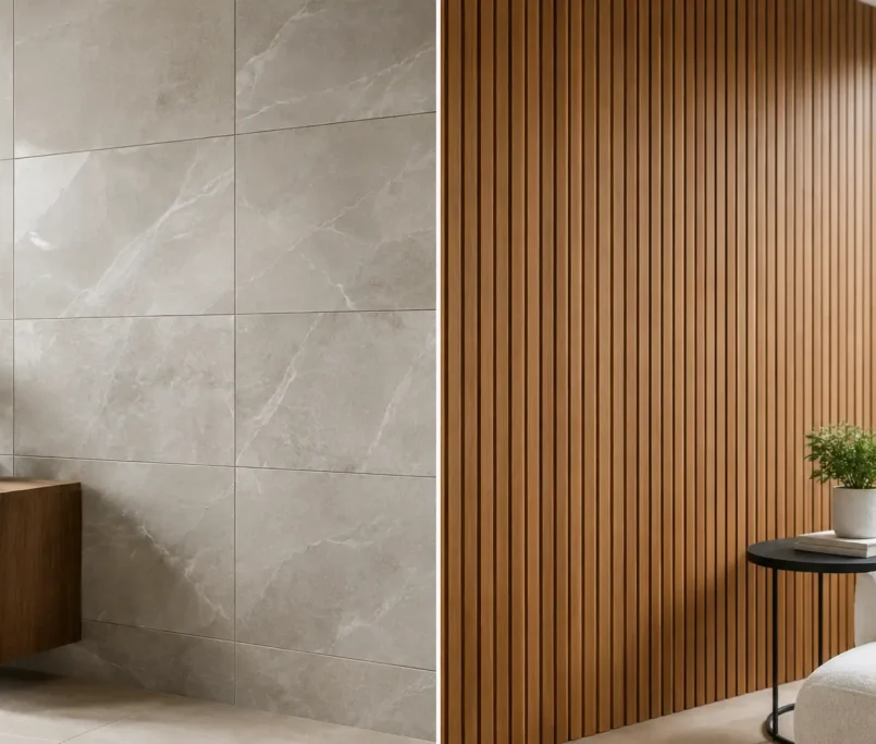
Large-format porcelain tiles and porcelain slabs suit kitchens with a pared-back, high-end aesthetic. Fewer grout joints can make a floor feel expansive and make routine cleaning easier. Stone-look, concrete-look and softly veined finishes are particularly effective where the kitchen flows into dining or living zones.
Less grout does not mean less skill. Larger tiles require a flatter substrate, appropriate adhesive coverage and accurate levelling to avoid hollow spots, lippage and cracked corners. Their weight and size also make handling, cuts around islands and transitions into neighbouring finishes more demanding.
For a kitchen floor, choose a finish with enough slip resistance for real life, especially around sinks, dishwashers and external doors. Highly polished surfaces may look striking, but a matt or satin finish is often the more practical long-term decision.
Basketweave and checkerboard: classic patterns with personality
Basketweave and checkerboard patterns bring a sense of heritage and craft. They suit Victorian, Edwardian and country-style homes, but they can also look fresh in a contemporary kitchen when the colours are limited to warm neutrals or soft tonal contrasts.
Checkerboard makes a strong statement on a floor, particularly in a generous kitchen with clear sightlines. In a compact room, smaller squares or lower-contrast colours prevent the pattern from overwhelming the space. Basketweave has more detail and tends to work best as a splashback, pantry floor or defined zone rather than across a very large open area.
These patterns reward accurate measurement. A balanced border at the room perimeter and symmetrical lines through a doorway or island are not minor details. They are what make the layout look intentional.
Grout is part of the pattern
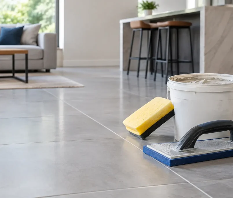
Grout changes the appearance of every layout. A close colour match gives a quieter, more continuous finish, which is useful with heavily veined stone-look tiles or a large-format floor. Contrast grout outlines each tile and makes geometric patterns more pronounced.
For kitchen floors, choose grout with maintenance in mind. Very pale grout can be beautiful, but it will show cooking spills, muddy shoes and everyday traffic more readily. A mid-tone shade often provides the best balance between a fresh appearance and realistic upkeep. On splashbacks, grout should also be properly finished and sealed where the product specification requires it, particularly near sinks and cooktops.
Joint width matters as much as colour. Rectified tiles can accept tighter joints, but they still need sufficient space to accommodate manufacturing tolerances and achieve clean alignment. A quality installation never forces tiles together merely to create the appearance of a finer joint.
Plan the details before installation begins
The strongest kitchen layouts are resolved before adhesive is mixed. This means confirming finished floor heights, appliance clearances, tile direction, splashback termination points, power-point positions and how the pattern meets windows, shelves and cabinetry. It also means checking the condition of the substrate.
Walls may need levelling before a precise stack bond or herringbone splashback can be installed. Floors may require demolition, re-levelling or screeding before large-format tiles can perform as intended. Skipping these stages is a false economy: the surface beneath the tile controls the quality of the finish above it.
It is also wise to view several tiles together before committing. Natural-look porcelain, handmade-effect ceramics and genuine stone can vary from piece to piece. Blending tiles from different boxes and planning their placement avoids clusters of colour or movement that look accidental.
A kitchen is used hard, seen often and expected to feel effortless. Choose a tile pattern that complements the architecture, then give it the preparation and precision it deserves. When the lines are balanced, the cuts are clean and the finishes are thoughtfully resolved, the pattern will continue to look right long after the renovation dust has settled.